Client work · Case study
Back to projectsMandrake Greek Street Food | Bilingual website
I turned Mandrake’s former menu-only website into a bilingual website for both restaurants, complete with bookings and local SEO.
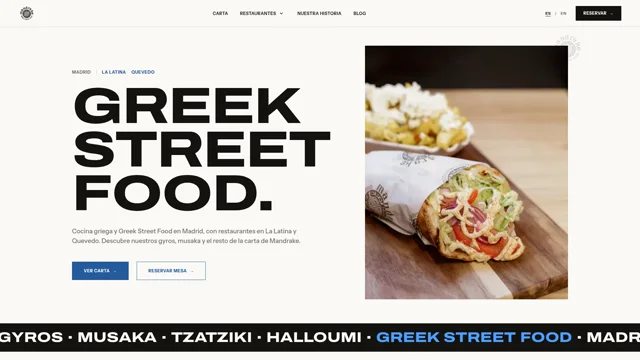
Starting point
The project before the code
Context
Mandrake’s previous website was limited to displaying the menu. It did not present the brand properly, distinguish between its two restaurants or support bookings. The project started from that minimal presence and turned it into a useful website for both the business and its customers.
Goal
Turn an online menu into a complete website that increases Mandrake’s local visibility and allows visitors to discover the brand, choose a restaurant and book a table.
The starting point
Mandrake’s previous website allowed visitors to check the menu and little else. It did not explain who was behind the restaurant, give each location its own space or support table bookings. The design also failed to reflect the personality the brand already had away from the screen.
This was not a matter of polishing that page. It needed to become a complete website. Mandrake already had a clear identity: a recognisable seal, heavy typography, blue, black and photography that keeps the food at the centre. My job was to carry that character into an experience that works for the restaurant every day.
Three actions needed to be easy to find: checking the menu, choosing between La Latina and Quevedo, and booking a table. I organised the rest of the content around them, including the Mandrake story, practical information for each location, reviews and the blog.
I handled the design, content structure, development and deployment. Spanish and English were part of the build from the start rather than treating translation as a final task.
Designing around the menu and booking flow
The homepage introduces the brand and leads directly to the menu or bookings. It then moves through featured dishes, both restaurants and the family story behind the business. I did not try to fit every detail into the opening section. Each subject has its own place and a clear next step.
The menu is a web page rather than a PDF. I organised dishes by category and prepared each item with its name, description, price and allergens. It reads properly on mobile, supports direct links to individual categories and allows one dish to be changed without exporting a complete document again.
The booking page starts by asking where the visitor wants to book. Each restaurant uses its own DISH system and keeps an alternative link for opening the booking flow outside the website. Separating both flows reduces the chance of a booking reaching the wrong location.
A dedicated page for each restaurant
La Latina and Quevedo share a design, but they do not repeat the same copy with a different address. Each page brings together opening hours, directions, photography, recommended dishes, reviews and location-specific questions.
I also worked on the data behind each location. The pages identify the address, coordinates, opening hours, cuisine and booking link. This information helps visitors and allows each restaurant to be described with its own structured data.
This structure also gives Mandrake greater visibility. Previously, there was very little content through which people could find the business beyond its name or menu. Each restaurant now has a page designed to answer searches related to Greek food, La Latina or Quevedo. This helps people who do not know the brand yet reach the website and become new customers.
The English version follows the same journey through translated routes. For example, /carta/ is paired with /en/menu/, while /nuestra-historia/ is paired with /en/our-story/. Changing the language opens the equivalent page instead of returning to the homepage.
A strong identity that still works on mobile
The expanded typeface sets the tone, but I did not use it everywhere. Headlines carry the visual weight while a second family handles body copy, opening hours, prices and controls. Blue guides specific actions without competing with the food photography.
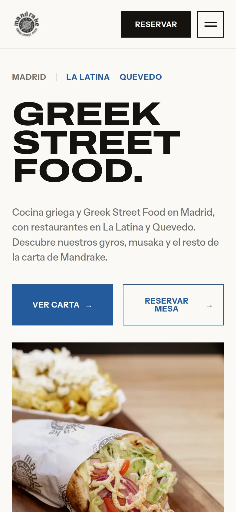
On mobile, I changed the composition instead of simply shrinking it. The message comes first, buttons retain enough space and the photograph moves below. Navigation opens in a dialog and reports its state to assistive technology. I also included a skip link and clear labels for controls.
Photography is served in WebP at several sizes. The main image receives priority, while later images retain explicit dimensions so the browser can reserve their space before each download finishes.
What sits behind the design
I developed the project with Astro, TypeScript and Sass. Astro delivers the main content as HTML, while JavaScript is limited to features that need it, such as mobile navigation, the review carousel and cookie preferences.
Each important page has its own title, description, canonical and language relationship. The menu, restaurants and breadcrumbs use structured data suited to their content. I also prepared the sitemap, robots.txt and legal pages.
Google Maps does not load until the visitor allows external content. That preference can be changed later from the footer. Basic information is not hidden behind consent, so the address and directions remain available on the page.
The result
What used to be an online menu is now a website that introduces the brand and leads visitors through to a booking. The Mandrake Greek Street Food website allows people to check the menu, compare both locations and book the correct restaurant. Its new structure also improves the business’s local visibility and helps attract customers who previously had no clear way to discover it. The English version keeps the same journey and each location retains its own information.
I have not included exact traffic, booking or revenue figures because I do not have permission to publish them.
This project continues the work covered in how to structure a maintainable multi-page website and the guide to hreflang for a bilingual Astro website. If you need a website for your business, you can explore my web design and development service.
What changed
Lessons learned
When a business has several locations, each one needs its own opening hours, address, booking flow and content, even though they share the same brand.
Turning the menu into structured content makes it easier to read on mobile, translate and update. It also allows direct links to each category.
Working on Spanish and English from the start avoids duplicated pages and keeps routes, navigation and metadata in sync.