Client work · Case study
Back to projectsPaula Márquez Brandon | Website for a professional supporting women
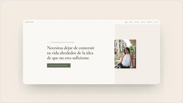
I designed and developed a 12-page website that brings together Paula's method, three programmes and client stories, helping visitors understand her work and contact her more easily.
Starting point
The project before the code
Context
Paula Márquez Brandon supports women dealing with self-pressure, guilt and the feeling of not being enough. She needed a website that brought together her method, programmes, story and testimonials while conveying calm and making it easy to get in touch.
Goal
Turn her work and support options into a clear journey where visitors can understand how Paula works, explore each programme and choose a direct way to get in touch.
The challenge: bringing Paula’s work to the web
Paula Márquez Brandon supports women dealing with self-pressure, guilt and the feeling of not being enough. Her work needed a website that could explain a personal subject clearly, without becoming cold or overcrowding every page with visual elements.
The project had to organise her method, three ways of working together, personal story and client testimonials. It also needed to maintain a calm visual identity and lead towards contact without turning every section into a sales pitch.
Architecture and journey
I structured the site into 12 public URLs. The homepage introduces the problem, shows the transformation Paula proposes, summarises the stages of her method and presents the different ways to work with her.
Her method, story, testimonials and contact details have their own pages. The three programmes are also presented separately: Alchemise, Movement and Nutrition, and the Clarity Session. Each one has enough space to explain its approach without mixing unrelated content.
The journey ends with concrete actions: contacting Paula on WhatsApp or sending an email. Visitors can first understand her work and then choose the contact route that suits them.
What the website gives Paula
The website gives Paula a space of her own to explain her method, present each programme separately and bring client stories together without forcing all the information into a social post or private message. She can also share the page that best matches each person’s interest.
Before getting in touch, visitors can understand who Paula works with, how she works and which options are available. This gives each conversation more context and lets visitors choose between WhatsApp and email without searching across different channels.
Design and development
I built the website with Astro and a responsive interface for mobile and desktop. The visual direction combines editorial typography, a warm palette and spacious compositions that support the tone of the content. Entrance animations are added progressively and respect the system preference for reduced motion.
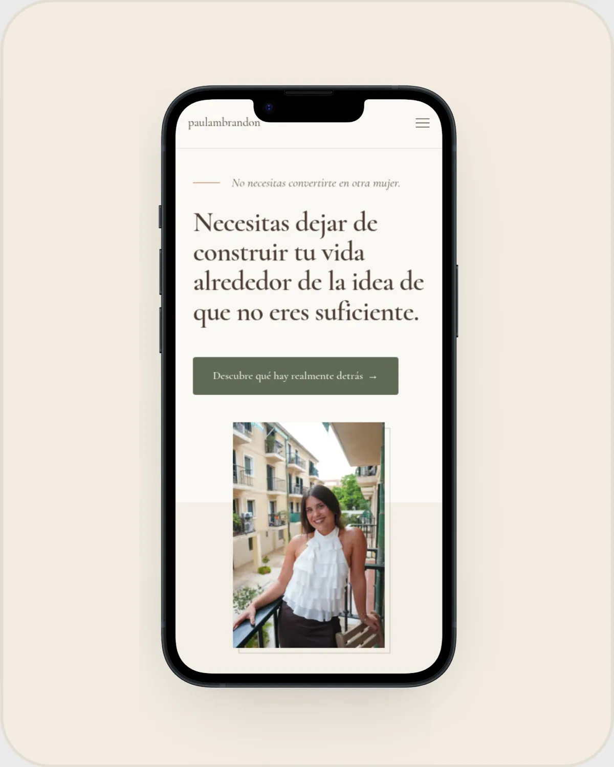
The mobile navigation communicates its state to assistive technologies and can be closed with the Escape key. Together with the skip link, semantic structure and alternative text, these decisions make the site easier to use with a keyboard or screen reader.
To keep photography from slowing down the page, the main portrait is served as responsive AVIF with high priority. The remaining images use WebP, responsive variants, explicit dimensions and lazy loading.
A foundation for sharing and understanding the content
Every published page is included in the sitemap and the website exposes a robots.txt file to support crawling. The homepage includes a specific title and description, canonical URL, Open Graph, Twitter Cards and a 1200 × 630 social image.
I also added structured data identifying the website and Paula as the person behind the brand. These technical elements help search engines and platforms interpret and share the content; they do not guarantee rankings.
The result you can verify
The Paula Márquez Brandon website is live with 12 routes, three programmes, testimonials, legal pages and direct contact options. The main content is delivered as HTML, while navigation and motion enhancements are added progressively, so the information remains available even when JavaScript does not run.
The website is set up for ongoing measurement. I do not include commercial results because I do not have authorised lead or sales data.
What changed
Lessons learned
A calm visual identity does not rely on colour alone: it also needs rhythm, hierarchy and enough space for each message to breathe.
On a website dealing with a personal and sensitive subject, design and interactions should support the content rather than compete with it.
Giving the method, programmes, testimonials and contact their own routes makes it possible to explain each choice without turning the homepage into an endless page.