Case study
Back to projectsConquer Languages: frontend case study
Frontend case study of an academic project: rebuilding the Conquer Languages website from scratch with HTML, Sass, JavaScript and Vite.
Starting point
The project before the code
Context
Final CSS project for the Conquer Blocks master. I rebuilt my English school’s website to apply my way of structuring code and organizing content.
Goal
Build a complete, attractive, and easy-to-navigate website that any real school could actually use, while keeping the code clean and ready to scale.
Why I chose this project
This is an independent academic project, not the official Conquer Languages website. I built it as my final CSS project to demonstrate how I approach the structure, responsive design and interactions of a multi-page site.
I could have made up a fictional website for the master’s final CSS project, but I wanted to work with something real. I chose the English school where I studied, Conquer Languages, and took their original website as a starting point.
I didn’t try to reinvent the wheel or do a drastic redesign. The goal was to build the same website from scratch, but applying my own criteria: my decisions on how to structure the HTML, how to organize the CSS, and how to polish the visual details my way.
The same website, built my way
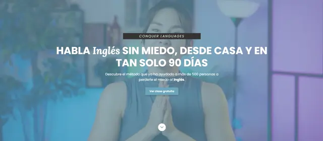
The result is a complete multi-page site that keeps the original essence, but built under my technical and design vision:
- A landing page introducing the school, their method, and how to start.
- The main course page with methodology details and animated student counters.
- A blog with learning articles, giving each post a clean layout for reading.
- An “About us” section and an integrated video player.
What mattered to me was that everything worked as it should. I carefully built every interaction: the mobile menu, the testimonials carousel, the FAQ accordion… The difference isn’t about making a radically different website, but making it right, with clean code and visual tweaks that, to me, made the interface much cleaner.
Two weeks of decisions
The project took about two weeks. Some days the work just flowed and I made progress without realizing it. Others, I’d get stuck tweaking something that didn’t feel quite right.
The most interesting part was making decisions. Even though I was starting from an existing base, I had to choose what to keep and what to simplify. My instinct sometimes pushed me to add more complex effects, but I ended up removing anything that didn’t bring real value to the reading experience or navigation.
What changed in how I work
This project taught me to let go. I’m the kind of person who enjoys adjusting every detail, but I discovered that without setting a limit, I never finish anything. Accepting my own perfectionism was key to finally closing the project and feeling proud of it.
I also learned that forcing the pace doesn’t work. My best days were the ones where I didn’t push myself. When I gave myself room, ideas came through cleaner and decisions were sharper.
What changed
Lessons learned
Perfectionism is a double-edged virtue: caring about every detail is good, but obsessing prevents you from finishing. Learning to let go is what allowed me to close this project with pride.
Real progress is not linear. There were days of moving forward without noticing, and days of getting nowhere. Giving myself permission to go at my own pace is when my best work came out.
Less is more. Every element I removed because it "solved nothing" made the result cleaner and more honest.
Next iteration
Future improvements
- Add a second version in English by converting the content into a structured collection.
- Migrate to Astro to be able to generate pages per course without duplicating HTML.