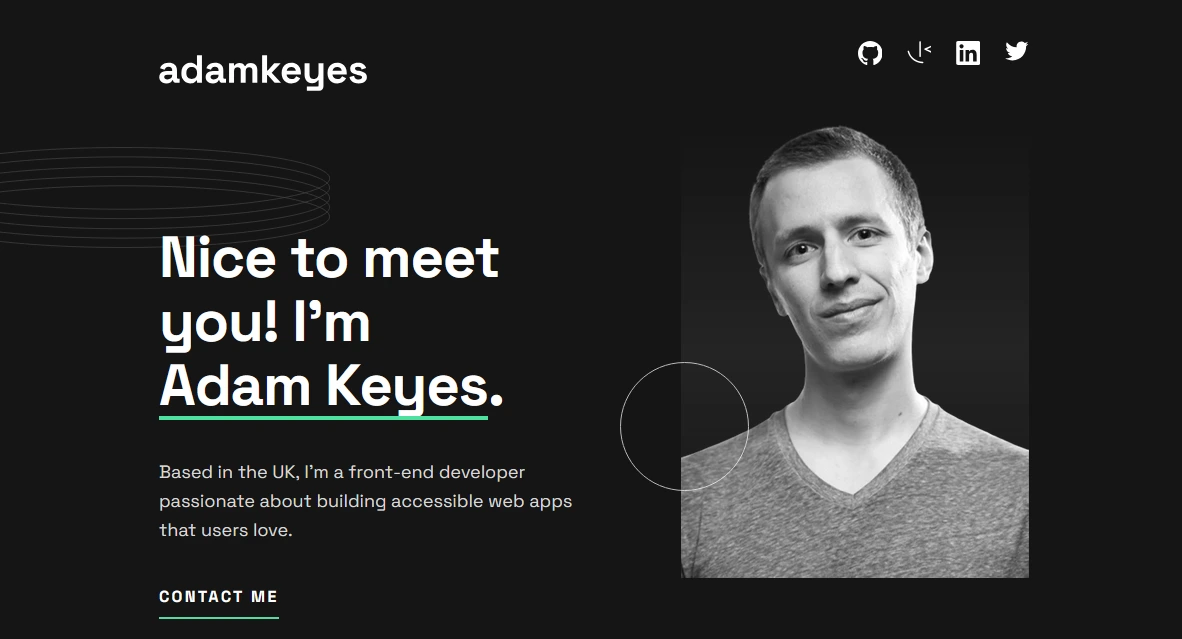
Context
Layout exercise from the Conquer Blocks master. The goal was to take a Figma design of a fictional portfolio and bring it to code while respecting every detail of the original design.
Goal
Demonstrate the ability to build a layout faithful to the original design, applying CSS best practices, modular Sass architecture and responsive design.
Un ejercicio que parece simple
En el máster de Conquer Blocks nos dieron un diseño de Figma de un portfolio ficticio y el objetivo era claro: llevarlo a código respetando cada detalle. Tipografías, espaciados, imágenes optimizadas.
Parece sencillo cuando lo describes así, pero la realidad es que maquetar un diseño de forma fiel requiere mucha más atención al detalle de lo que parece. Cada decisión de CSS importa.
Cómo lo construí
Monté el proyecto con Vite y organicé todos los estilos con la arquitectura 7-1 de Sass: variables, mixins, funciones y cada componente en su propio archivo. La tipografía personalizada con Space Grotesk, animaciones de scroll suaves con Lenis y validación del formulario de contacto en el frontend.
El diseño es completamente responsive y accesible, pensado para que funcione igual de bien en móvil que en escritorio.
Lo que me enseñó
Este tipo de ejercicios te entrenan para lo que luego necesitas en proyectos reales: ser capaz de coger un diseño y llevarlo a código sin que el resultado se aleje de la intención original. Parece básico, pero es una habilidad que marca la diferencia.
An exercise that looks simple
In the Conquer Blocks master we were given a Figma design for a fictional portfolio and the goal was clear: bring it to code while respecting every detail. Typography, spacing, optimised images.
It sounds straightforward when you describe it like that, but the reality is that building a layout faithfully requires far more attention to detail than it seems. Every CSS decision matters.
How I built it
I set the project up with Vite and organised all styles using the Sass 7-1 architecture: variables, mixins, functions and each component in its own file. Custom typography with Space Grotesk, smooth scroll animations with Lenis and frontend contact form validation.
The design is fully responsive and accessible, built to work just as well on mobile as on desktop.
What it taught me
These kinds of exercises train you for what you actually need in real projects: being able to take a design and bring it to code without the result drifting from the original intent. It sounds basic, but it’s a skill that makes a real difference.
Lessons learned
The Sass 7-1 pattern forces you to think about code organisation before writing a single line. That pays off later when the project grows.
Building a layout that is faithful to the original design seems like a rigid exercise, but it trains your eye to spot inconsistencies that do affect the end user.